For any brand to achieve lasting success, adaptability is essential — and Etinco is not an exception. Over the course of more than a decade, we have refreshed our logo five times. Each redesign marked a pivotal transformation — signaling new milestones and a strengthened position in the import and distribution of electrical equipment.
2011 - 2012 Period
Etinco Co., Ltd. was officially established on April 14, 2011. Our first strategic partnership was as an authorized distributor for LS Electric low-voltage equipment and Hyundai electrical devices.
Our original logo reflected our early identity in the most direct way — highlighting our brand name and core business through a stylized “E.” This “E” symbolized both Etinco and Electric, capturing the very essence of who we are and what we do.
2012 - 2013 Period
Just a year after our founding, we made our first logo change. The new design took inspiration from the Internet Explorer symbol — a globally recognized icon at the time.
Beyond its visual alignment with the “E” in Etinco, the Explorer motif reflected a forward-thinking mindset. It was a bold move by our leadership to realign the brand’s identity in tune with the global shift toward digital transformation — especially relevant to Vietnam’s fast-evolving market.
According to the 2012 report by the Consumer Research Institute for E-commerce, Vietnamese consumers were increasingly turning from traditional and direct purchasing into online shopping. As a result, many enterprises have to change to adapt this trend and Etinco also anticipated and acted decisively. Our redesigned “E” with an orbiting ring symbolized connectivity and expansion — key themes as e-commerce surged in popularity. It echoed our founding slogan, “1-minute purchase”, which emphasized speed — a core value Etinco still embraces today.
This transition was also marked by a major investment in our website — positioning it as a vital communication and sales channel for branding, customer engagement, and contract management.
2013 - 2018 Period
As e-commerce in Vietnam matured, consumer behavior shifted from group-buying platforms to complete end-to-end transactions on integrated platforms. Etinco responded with a logo evolution that reflected this new business reality.
The 2013–2018 logo was an enhanced version of the 2012 design — maintaining the stylized “E” inspired by Internet Explorer but with refined touches: the “VN” letters were removed, and the color scheme changed from deep blue to industrial gray, aligning with the nature of our industry. Importantly, this third-generation logo was officially registered and protected under intellectual property laws, marked with the ® symbol.
In parallel, our business ecosystem expanded significantly — introducing Nuintek capacitors from South Korea in 2016, and becoming a distributor for top Vietnamese cable brands including Cadisun, Cadivi, and Trần Phú by 2018.
2018 - 2024 Period
By 2018, Vietnam’s e-commerce landscape had matured. For Etinco, after seven years of growth, it was time to consolidate our brand. Rather than chase trends, our new logo embodied long-term values — with a stylized house shape enveloping the letter E, symbolizing a connected, supportive “Etinco family”.
This period also marked significant international partnerships. In 2019, Etinco began collaborating with HanKwang (South Korea). In 2020, we became the strategic partner of BTB Electric (Turkey) — a brand with nearly 50 years of expertise. By 2021, Etinco became the first official distributor of LS RMU Medium Voltage Cabinets in Vietnam, reaffirming our longstanding partnership with Korea’s leading electrical manufacturers.
2024 - Present
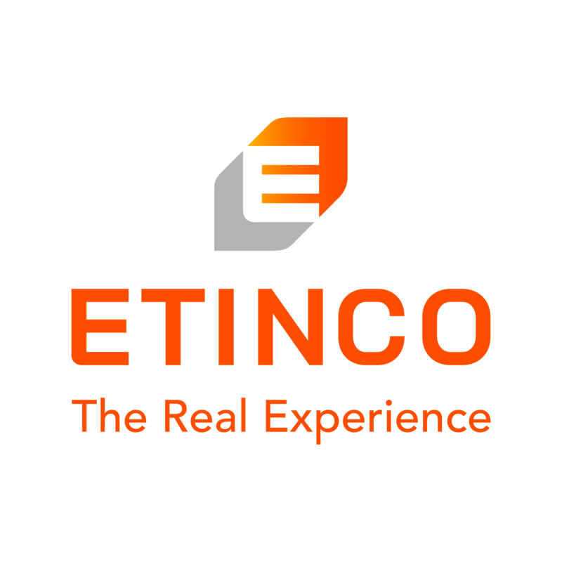
The year 2024 marked a turning point in our journey — celebrating Etinco’s 13th anniversary with a bold brand repositioning. Our visual identity — unchanged for over a decade — was completely transformed to reflect a more modern, creative, and energetic Etinco. The signature orange and gray palette remains, representing innovation and decisiveness. However, the logo and slogan were reimagined to reflect our elevated status in the electrical equipment sector.
The new “E” in our logo still represents Etinco and Electric, but now takes the shape of a compass magnet — rich in symbolism:
- The magnet is the earliest known electrical device.
- The magnet is also the signal of the guiding compass needle, the guiding compass, the orientation of development
- The magnet also carries the message of the consensus and determination of all Etinco members: Common aspirations, common goals, common development.

Beside logo, there is an evolution on our slogan.
Our slogan, “1-minute purchase”, which defined our focus on speed (fast orders, fast quotes, fast shipping, fast service) for over a decade, has now evolved into - “The Real Experience”. This new statement reflects our mission to deliver genuine, trustworthy experiences in the B2B electrical market and beyond. Every customer interaction with Etinco is driven by sincerity — real products, real consultation, and real connections.
In the specialized B2B market, Etinco’s logo changes were never superficial. Every shift was underpinned by thorough research and market insight. This latest rebranding is aimed at better serving the modern B2B customer and aligns with our new goals and position. Similarly, modernizing our brand is part of our commitment to improving customer experience, adapting to global trends, and staying ahead in an increasingly commercialized world.
A new logo doesn’t redefine who we are — it’s simply a visual step in realizing the long-term vision we’ve committed to. The true transformation lies in our strategy, flexible and decisive leadership of our head on product development, and brand values — all working together to shape the Etinco of the future.


